A word about metrics, part III: market share of Google Docs?
I’m not sure what Google Docs market share is, but I thought it would be interesting to mention a couple data points and add a new data point. Data point #1: Compete. Compete just estimated that 4.4M visitors stopped by Google Docs in September, which is just a hair below 2.4% of the U.S. online population, according to them. Compete buys data from ISPs, among other sources, but doesn’t reveal which ISPs sell their surfing data, so it’s hard to tell if those ISPs’ users tend toward tech-savvy vs. newbie or affluent vs. lower income. One other metrics service (Nielsen//NetRatings) has claimed that Google Docs users tend to skew toward higher-incomes and are more likely to be technology early adopters.
“From May to November 2008, ClickStream Technologies recruited 2,400 U.S. internet users over the age of 18 to complete a survey and install ClickSight® …. Participants were recruited through a market research firm which awards cash and prizes in exchange for completing online surveys.
- Sample is self-reported (in initial recruitment survey) as 65.5% female, 34.5% male…
A few things come to mind:
- 2,400 users is not a ton of people.
- Tech-savvy, more affluent users are probably less likely to agree to click-monitoring in exchange for cash and prizes. I would go so far as to say most tech-savvy users would actively avoid such offers. If Google Docs users really do skew more toward affluent/tech-savvy (and I think that they do), that would result in fewer Google Docs users in ClickStream’s consumer panel.
- 65.5% female users sounds way too high. I think a more representative number is something like 52% of the online population. If ClickStream is getting 65%+ female users and not even in the 50% range, there could be all kinds of sampling errors in the data, e.g. if users were recruited from sites that didn’t represent the overall internet population.
I was thinking about ClickStream’s study and how it got a fair amount of coverage that implied Google Docs might be struggling, despite the fact that ClickStream recruited a relatively small number of users by offering cash/prizes to complete online surveys. And I asked myself: “Matt, are their any application monitoring services that tech-savvy people do use?” As soon as I asked that, I remembered that I signed up for Wakoopa recently. Wakoopa is a Web 2.0 website + client-side download that lets you track and share which applications you run. It’s the sort of service that tech-savvy users like Louis Gray are likely to use, and Wakoopa just recently started tracking web apps.
Datapoint #3: Wakoopa. Let’s see how many people are using various applications on Wakoopa. A little bit of searching turned up these stats:
Windows Explorer: 23,985 people
Finder: 6,254 people => 23,985 + 6,254 = estimate of 30,239 active users
Word: 14,985 people
OpenOffice: 3,762 people
Google Docs: 1,516 people
Corel WordPerfect: 80 people
I don’t think Wakoopa says how many active users they have, so I took one popular-but-Windows-only app (Windows Explorer) and one popular-but-Mac-only app (Finder) and added them to estimate that Wakoopa has about 23,985 + 6,254 = 30,239 active users. The reasoning is that if you’re running Windows or Mac, you’d expect that Wakoopa would see you running Windows Explorer or Finder at least once. Now let’s see how ClickStream and Wakoopa compare:
| Application | % of users (ClickStream) | % of users (Wakoopa) |
| Word | 51% | 49.6% |
| OpenOffice | 5% | 12.4% |
| Google Docs | 1% | 5.0% |
| WordPerfect v.12 | 3% | 0.3% |
It’s easier to see this as a graph:
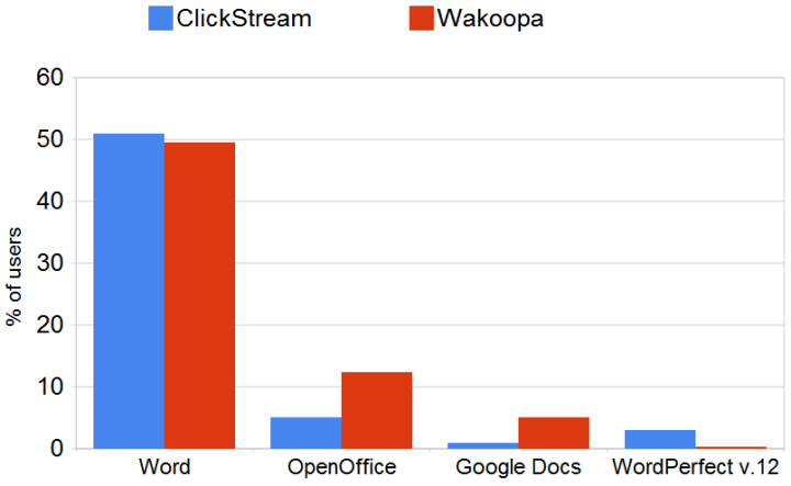
According to ClickStream, users are 3-5x more likely to use WordPerfect than Google Docs. But Wakoopa’s data suggests that Google Docs is about 20x more popular than WordPerfect. So who’s right? Well, both sources of data have self-selection bias. Wakoopa gives data on at least 10x as many users as ClickStream, but you have to bear in mind that Wakoopa’s users skew toward the tech-savvy. If you have friends that sign up for cash/prizes in online studies you might lean toward the ClickStream numbers. If you run with a more Web 2.0 crowd or don’t know anyone that runs WordPerfect, you might believe the Wakoopa data. If ClickStream disclosed their percentages of (say) IE vs. Firefox/Chrome/Safari/Opera, I suspect that would also help calibrate the differences. The correct answer is probably somewhere in between the 1% estimate from ClickStream and the 5% estimate from Wakoopa.
Google Docs is clearly the underdog in this area. But I’ve talked before about how Google’s tech-savvy user base can skew usage metrics. It would be a shame if people read the ClickStream Technologies press release and failed to consider some of the additional factors in estimating market share.
www.mattcutts.com
published @ November 18, 2008