Redesign Bravery And The Nature Of Feedback
Our UI designer Timmy let me use the new Q&A section of the site for a few days before asking me, in a more specific fashion, if it worked all right. Q&A, in fact, has changed far less than some other parts of the site, although I appreciated both the question and the fact that he let me get used to it before asking for feedback. Because redesigns aren't just about what the site looks like: they're about how it functions.
In the secondary navigation at the top of the screen (the blue bar), you'll see a drop-down menu labeled "SEO Resources." From that list, people can access PRO Guides, video tutorials and PRO tips, the Social Directory and Link Directory. Some of these things were notoriously difficult to find on our old site: I could never remember how to best access some of them and I always typed in the URL instead. How's that for usability?
Changes such as this aren't done for the sake of aesthetics and suggest that one should not judge a redesigned website too quickly. It's really easy to lay eyes on something different and immediately decide that it's unpleasant. In fact, being unsure about something seems to be a basic human response to visual change.
It would be a shame if knee-jerk reactions to redesigns made people fear redesigning. Not very long ago, SEOmoz looked like this:
One simple tab ("Boxes", for those of you who don't use the site) took care of a problem that threatened to compromise the company's design foundation. Of course, they didn't get away with their redesign without the typical rabid backlash.
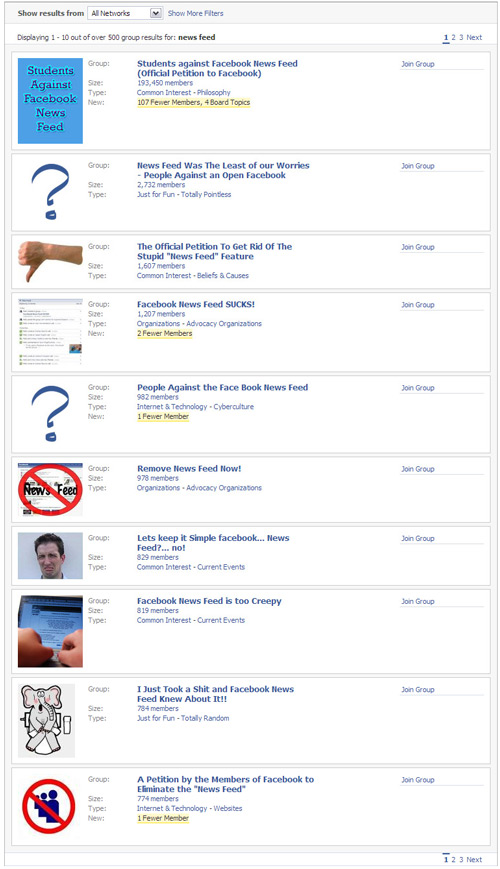
Let me take you back to Spring 2007 when Facebook implemented a relatively design update, but also launched their News Feed at the same time. People were outraged. Letters were written. Feet were stamped and fists were waved. Facebook quickly added extra security and privacy features, but people still called for the Feed's termination. And do you know how many people now basically rely on the News Feed and consider it to be the basis of the site's usefulness? And how many people would throw their toys out of the crib again if Facebook took the News Feed away?

The problems people have with popular sites' redesigns often seem to have less to do wtih how "awful" the changes really are and more to do with a dislike of change. The day Twitter rolled out its (minor) design changes, the disgust and outrage were overwhelming. Now, I guarantee that no one even notices that the site looks a little different to what it looked like a month ago.
What should website owners take away from this? My explanations and examples are really a long-winded way of saying that a majority of people are going to at least look sideways at big website changes, even if those changes are actually for the best. The real test of whether a site's redesign is good or bad will develop over weeks and months. No one should ignore constructive negative feedback, but "I don't like it" doesn't mean that you have done a bad job. I didn't like Last.fm's recent redesign (I thought it looked less professional and... well... I liked the old one... um... it was shinier...) but after using it for a while, I noticed the improved functionality and additional features, and it dawned on me that the header banner wasn't the entire story when it came to how I used Last's website.
After one week of using this site with its new design, I find that working within it is easier than it used to be; however, it's probably still too early for me to have a clear idea of how the new site works on a macro level. After a while, you understand a website in the way you understand your town. When I first moved to Seattle, I knew where my apartment was and how to get to work, but now, two years later, all I need is a street address and I can drive to a location on the other side of the city. It takes a little time to become that familiar with a website, even if it's only a redesign of something you knew well before.
For a while after their recent changes, Facebook had a feedback link in their navigation where users could make suggestions. I hate to imagine some of the abuse they received through that outlet (despite a polite reminder to keep suggestions useful and civil), but active users of the site will have noticed continued changes. I have to believe that staff received many good ideas through that feedback form, some of which will have made it all the way to the live website.
SEOmoz has been lucky with our community's mainly-positive reactions to our changes, especially when they're quite drastic. As the surprise of a tune-up and new paint work wears off and you continue to use our redesigned site, what are some of the things you find difficult about it? What do you like? Do you miss things from the old version and if so, can you see a place for them in the new site?
www.seomoz.org
published @ October 16, 2008